
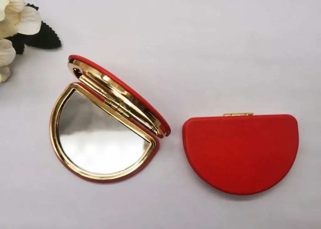
A Pantone number can establish a color direction, but it does not make every red PU surface look identical. The same nominal color can appear lighter, deeper, warmer or more saturated when the substrate, grain, coating, gloss and lighting change.
This guide explains how a physical PU swatch resolved the main approval risk in a completed mirror-led GWP project. It focuses only on color approval. For the complete project record, see the Australian beauty brand mirror and pouch case study.
Why a Pantone Reference Is Not the Finished PU Color
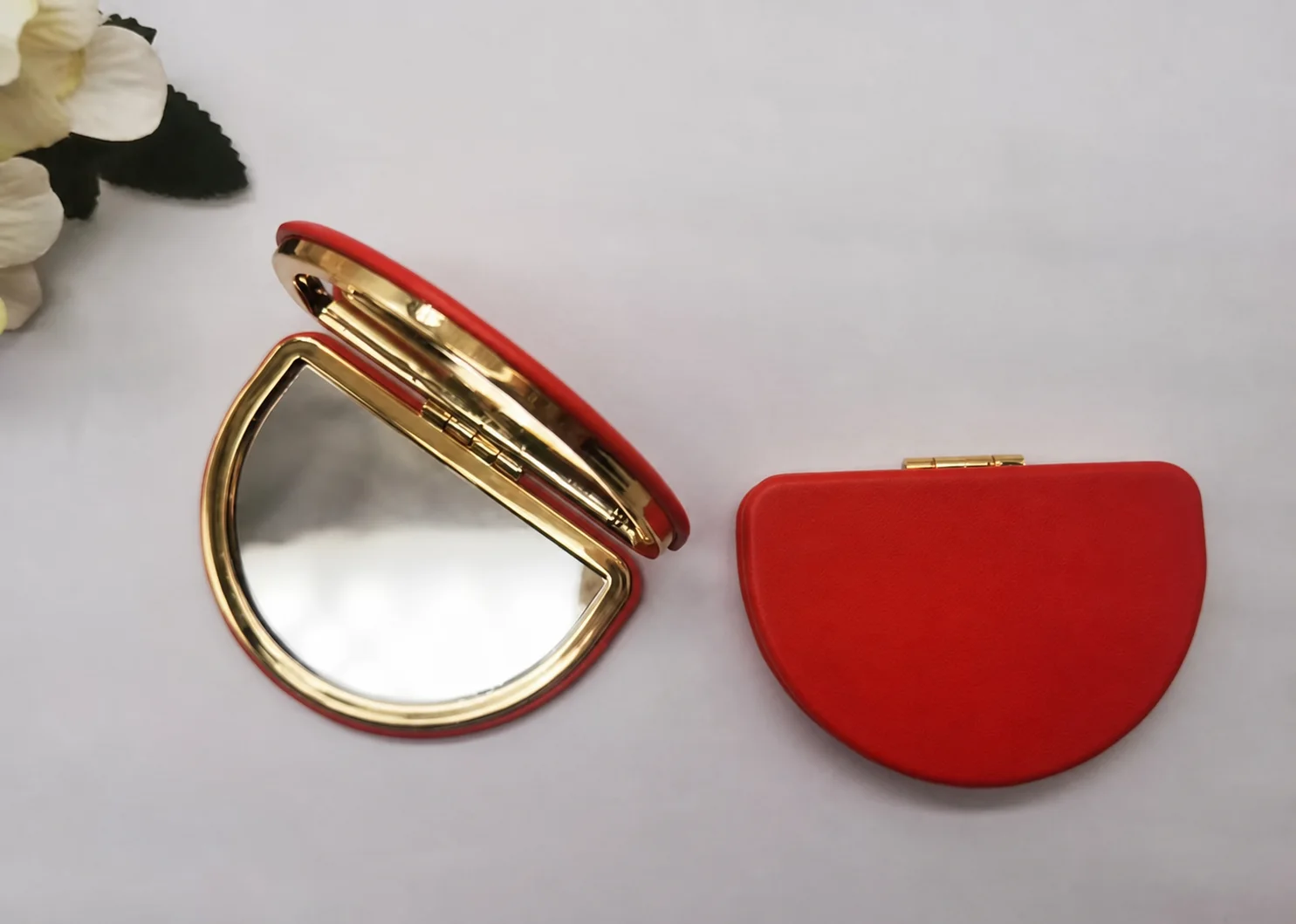
Pantone is a valuable communication reference, especially at the start of development. It does not remove the need to approve the visible result on the actual material. A printed Pantone chip is viewed on paper; a mirror cover may use textured PU over a shaped shell, beside plated metal hardware. Those surfaces reflect light differently.
- Grain and texture: raised texture creates highlights and shadows.
- Gloss level: matte and glossy finishes change perceived depth and saturation.
- Base material: the substrate and coating build can influence the final appearance.
- Adjacent hardware: warm gold, silver or another metal finish changes how the color is perceived.
- Lighting: daylight, warm indoor light and cool retail light can reveal different undertones.
- Camera and screen: automatic exposure, white balance and screen settings distort comparison.
The Real Project Problem: Video Could Not Show the Red Reliably
For a July 2024 Australian beauty-brand GWP project, the buyer’s main concern was color consistency. The selected mirror used a red PU exterior with gold-colored metal hardware. During development, video was not accurate enough for the buyer to choose the PU color against the Pantone direction.
The issue was not solved by repeatedly changing a digital file. Physical PU color samples were sent to the buyer. The buyer selected the material reference, and the mirror sample was then made to that approved selection. The supplied project record identifies one revision round.
When to Request a Physical Swatch
A physical swatch is especially useful when:
- color is a central part of the brand identity;
- the surface is textured, soft-touch, metallic, pearlescent or high gloss;
- the product combines several materials that must look coordinated;
- the buyer is selecting between close shades;
- the material cannot be reproduced accurately in a screen image;
- the approved color will control a larger production run.
A swatch does not approve the entire product. It approves a material or finish reference. The completed physical sample still needs to show how that material looks after cutting, wrapping, forming, stitching, printing or assembly.
A Practical PU Color Approval Sequence
1. Define the target and tolerance question
Provide the Pantone or other brand reference and explain whether the priority is an exact visual match, a coordinated family of colors or selection from available PU stock. Ask what the supplier can control and what natural lot variation may remain.
2. Select on the intended material
Compare physical PU swatches, not only a PDF, photograph or video. Label each swatch so the selected reference can be identified later. If the mirror and pouch use different materials, approve each material separately.
3. Review under relevant lighting
Check the material under neutral daylight and the lighting expected in retail or use. Avoid approving a color from one phone screen. Where color is critical, record the viewing conditions used for the final decision.
4. Approve the material beside the hardware and logo
A red cover can look different beside warm-gold hardware than beside silver. The printed logo also changes the visual balance. Review the complete color relationship on the actual sample.
5. Record the controlling reference
The sample approval record should identify the selected swatch, supplier material code or dated approved sample. Photographs can support the record, but the physical reference should remain controlling when the screen image cannot represent it accurately.
What Buyers Should Put in the RFQ
- Target Pantone or brand color reference
- Actual substrate and surface texture requested
- Required gloss or tactile direction
- Adjacent hardware or plating color
- Logo method and logo color
- Whether stock-color selection is acceptable
- Whether physical swatches must be sent before sampling
- Who will keep the approved reference for production comparison
The broader custom mirror gift set RFQ checklist covers component count, accessory specifications, packaging, carton data and delivery requirements.
Evidence Boundary
This article documents one project’s color-approval method. It does not establish a universal color tolerance, claim that every PU can match every Pantone value, or prove a fixed number of revision rounds for other projects. Material availability, approval method, timing and acceptable variation are confirmed per project.
Discuss the color and material approval route for your mirror gift set.